By Matthew Gourlie
With the York9 FC launch set for Thursday, let’s conclude our three part discussion of branding for the Canadian Premier League by focusing on kits.
The difficulty when evaluating kits is that so much of their appeal is subjective. The quality of a logo in particular, or even a name, feels much more objective than what makes a great shirt design or overall look. One person’s classic may be dull to another. What might be a dated monstrosity in some eyes may be retro cool to others.

Two classic looks in the Old Firm derby, though I think Rangers should still wear red socks and Celtic should return to the over-sized number on the shorts.
A lot of the best jersey ideas are incredibly simple: Celtic’s hoops, Ajax’s red vertical bar, the Canadiens wide blue hoop with white trim, the New York Yankees pinstripes, the All Blacks in all black, Michigan’s wolverine helmets, Notre Dame’s golden dome helmets, the hue of North Carolina blue in college basketball.
Those teams play different sports and have been prominent in different eras, but the thing they have in common is consistency.
Styles and trends will come and go and I think the CPL should follow those trends — for better or worse — but the best kits all have timeless elements that endure through the changes. That is where the designers of the CPL kits need to make their mark.
Finding a simple design element and making it unique — and then sticking to it — is very hard. Which isn’t to say it’s not worth trying to achieve. It’s a very fine balance to design something with the idea of it taking root and enduring for decades while also not making it feel forced.
Some iconic Canadian sport designs came from unexpected places.
The B.C. Lions distinctive burnt orange colours came from the Meralomas Rugby Club (that began as an aquatic club) that had some success in football in the 1930s.
The Toronto Argonauts took their blues from the colours of Oxford and Cambridge. The famed English universities lent their shades to the Argonaut Rowing Club when it was founded in 1872 — well before the club fielded a football team. Who could have predicted that the two foreign schools who race boats down the Thames every spring would lend their colours and create a nickname (the double blue) to a Canadian football team?
The Montréal Canadiens originally wore blue and white and then red with green accents. In 1912 they switched to the “bleu, blanc et rouge” but did so with a barber pole look. The Ottawa Senators, who already had similar stripes with black instead of blue, complained. A year later Montréal went back to their predominantly red look, but retained a two white bands and a thick blue band.

Ajax’s broad red stripe might be the best look in world football. And it was borne of necessity. When they were promoted to the top flight for the first time in 1911, they had red and white vertical stripes and dark shorts. Much like les Canadiens, Ajax was forced to change because an existing top flight team — Sparta Rotterdam — had the same kits. The newcomers opted for one wide red stripe instead of many.
The classic counter to Ajax’ great broad stripe is the golden band of Boca Juniors. It’s hard to wrong with navy and gold. Those kits looked sharp in 1920 and will look sharp in 2020. If they could just get the sponsor off of the stripe it would be perfect.

Diego Maradona wearing the classic Boca Juniors kit. Getty Images
Italy’s Sampdoria has a band comprising three colours, but it achieves a similar minimalist effect. They also take the blue from their home kit to add onto the band on their great away kit.
So what makes a great kit design element? The best ones — like Ajax — are incredibly simple.
Almost all of the most famous clubs in the world have a fairly basic kit that is synonymous with them: Celtic’s or Queen’s Park Rangers’ hoops or AC Milan’s or Barcelona’s stripes or River Plate’s or Peru’s sash. Real Madrid’s white, Borussia Dortmund’s yellow and Bayern Munich’s red. There are blue-red derbies that are a fixture of two of Europe’s top league with United-City in Manchester and Liverpool-Everton to the Italian derbies of Lazio-Roma and Inter-AC Milan.
These colours are so tied to the club’s identity that they also served as nickname for the club: the reds, the blaugrana, i rossoneri, etc.
You can learn from their economy of design, but their 100-plus-year head start doesn’t leave a lot of fresh colours or designs for a club to grab onto and make their own. Which is where subtle touches become so important.


Take Arsenal for example. It’s so simple that it doesn’t always register, but an all red kit with all white arms and white shorts is surprisingly evocative and not very common. It is a basic colour combination, simple design, but if you turn on a match and see someone in red with white arms, you think Arsenal immediately.
The Atlanta Apollos couldn’t have a simpler kit (and it was a look that was common in the NASL in 1973), but their crimson with a white hoop is brought to life with a simple gold number and really stands out from the early NASL era.

Cheung Chi Doy, a Vancouver Royals forward, is pictured in their 1968 kit. Cheung, a Hong Kong native, was a pioneer, playing with Blackpool in the English top flight in 1961.
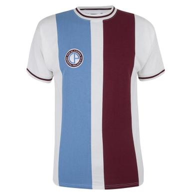
Similarly this Vancouver Royals kit (which is red) has a simple white vertical stripe broken up by the badge. If you took that look into the 21st century you might end up with the current Canadian home kit.
They’re very small touches, but they help set fairly basic colour combinations apart.
Sometimes the distinctive element is a lot more outside of the box. Club Puebla in Mexico have had a sash since 1944.
East Germany’s FC Karl Marx Stadt had a simple, but different two-tone kit that makes use of an uncommon design and a subtle variety in terms of colours that makes a big difference. FC Karl Marx Stadt is now called Chemnitzer FC after Chemnitz regained it original, non-Marxist name. They have an all-blue kit in the same shade and a similar logo.

East Germany’s FC Karl Marx Stadt.
Meanwhile Girodins de Bordeaux have had their pronounced V neck off-and-on since the Second World War. They’ve had different kit manufacturers that have tried different things with the element, but it has endured decade after decade because it is both distinct and flexible. They have even changed the colour of their kits slightly to a more modern and deeper colour, but because the V is so iconic — even when used subtly as it is now — the changes aren’t that radical.


Most teams don’t start out with their iconic look. The trick is that when you strike upon a great look, grab onto it. Have enough faith in your vision to give it some time and see if strikes a chord.
Crystal Palace haven’t had a very consistent look over their history, but have primarily used red and blue stripes in some combination. These Crystal Palace kits from 1972-73 lasted one season. Why you would come up with something so striking and go away from it is beyond me. You can move and change the badge, add a collar, there’s lots of ways to tweak it with the times, but the general look of the two thick stripes is pretty distinct.
Early on, it seems prudent for the CPL to keep it simple as they try to establish familiarity with their teams within their fanbases. Clubs will change their away kits regularly. They will trot out special third kits (or special themed third jersey and throw-backs in every other sport), but the home kit — nay the main kit, which should be worn home or away lest their be a kit clash, as God intended — should be consistent.
There gets to a point where you think that there isn’t anything new under the sun, but then you start seeing looks that aren’t used any more that still stand out as inventive and unique like that old Palace kit.
The Major Indoor Soccer League’s Tacoma Stars had one of the best kits I’ve ever seen. I loved it the first time I saw it as a little kid. I always thought of it as a very ’80s design, but to me it still looks great. The logo is bad and they’re still following the original early-80s placement of the logo in the middle of the kit, which seems unnecessary in the 21st century. None of it matters. The white, the blue and yellow and orange diamonds — I’ve wanted to own that kit for 30 years.

The Tacoma Stars kit still gets an A+ from me. That playing surface gets an F, though.
I am sure there are people who think that kit is garish (the Houston Astros’ tequila sunrise jerseys are similarly divisive), but it’s different and I would argue enduring.
Indoor soccer had some doozies in its time, but they also had some pretty strong kits. The Wichita Wings orange were distinct and worked when they kept them simple, the Cleveland Force had a terrible name and a busy and confusing logo, but managed a decent kit, the St. Louis Steamers had some clean looks and I will go to bat for the Kansas City Comets white kits. They needed to change the logo size and placement, but the triple sash wasn’t bad for the era and could have been re-worked in the 21st century. When they were reborn in 2010 they went right back to the old logo and kits.
The CPL’s kits don’t need to each be different for the sake of it (this one is hoops, this one has stripes, this is all white, this is all black, this one is divided in half, etc.), but a little creative thinking can really set a kit apart.
I think expanding the colour pallet is a really under-rated approach.
Even from the start MLS has been good at using colour. At the outset their designs were mostly hideous and all of the Nike-branded teams used far too many colours. However, once distilled, some of the colour schemes weren’t bad.
The San Jose Clash kits had six colours and were a mess, but there was room to work with those shades of blue and gold (or sand, apparently) to design something good.

Before becoming Chelsea’s technical director for seven years, Michael Emenalo played for the San Jose Clash. There are far too many colours here, but I think there is something salvageable from those shades of blue and gold with the white
The Tampa Bay Mutiny had garish kits out of the gate, but given a couple of years to lock in on what was good about their colour scheme, they managed to look pretty good in some Gremio knock-offs. Ripping off another club’s kit is pretty lame, but the colour combination was nice even if the stripes were derivative.
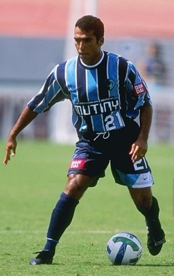
Marco Ferruzzi of the Tampa Bay Mutiny moves the ball during a game against the Kansas City Wizards. Andy Lyons/Getty Images
Soccer is a sport that has always leant itself to colour. In the straight-laced world of baseball — where purists have very serious thoughts about the proper way to drop the bat — most teams wear white and grey. Football used to be rife with dark colours to prove their machismo and intimidate their foe (who is intimidated by jersey colours? Even the Oakland Raiders were more intimidating because they were all half-crazy, not because they wore black).
Now, those same NFL teams are trying to branch out, wearing hideous “color rush” uniforms on Thursdays, while the NBA has created a whole new line of third jerseys.
While the NFL goes technicolor, MLS is going in the opposite direction with kits so monochrome they look like the hockey game in Strange Brew.
For all of their intelligence in using the entire colour pallet, MLS seems to be getting off course. This year they have nine mono-black or grey kits and 14 mono-white kits. I don’t hate simplicity. DC United’s black look works. So does Columbus’ as a change kit. An all-white can look really clean. Two weeks ago they used kits made from environmentally friendly, upcycled plastics from the ocean that were either all white or all grey. It’s a really cool initiative, I’m behind it, watching matches that weekend — particularly a few in a row — felt like being in a weird post-apocalyptic, dystopian future. Every match was white against grey.
It isn’t even just the special Earth weekend. It’s become a practical problem in MLS that at a glance you don’t even know who is playing. If there are multiple games at the same time and you flip between them (thank you DAZN), there have been games where it’s not obvious which team is which. Take Sporting Kansas City’s season opener when a crowd full of supporters in sky blue kits watched a team wearing the home team’s colours of sky blue, white shorts and sky blue socks beat a team in all-grey 2-0. The only problem was that NYCFC was the team in blue and Kansas City were wearing grey at home against the only team in the league who has the same colour scheme that they do.

Jim Brennan shows that the Toronto FC kit hasn’t changed much since 2007. Getty Images
Credit to Toronto FC and DC United for being the only MLS franchises of any long-term standing who haven’t messed too much with their main kits (though DC United’s early white kits were sharper and should have been their main kits).
It looks like Atlanta FC are on their way since they latched onto “the five stripes” and feel bound to that.
One of the only good things about the Philadelphia Union in their history was their kits. They weren’t great with a dull, dark blue, but they had a wide gold stripe down the middle — much like Ajax — and that dark blue with gold stripe is mirrored (though oddly in reverse) on their badge. The wide stripe was also effectively used for one of the better away kits of the last 10 years. Yet, this season they got rid of the gold stripe. They also continue to keep Bimbo as a sponsor, so perhaps they’re afraid of selling kits and making money.
Of course not all change is bad. It often takes a few tries before finding an enduring look.
The Vancouver Whitecaps went from bland white and red kits, to a burnt orange along the lines of the B.C. Lions. With the distinctive Admiral “braces” of the mid-70s, it’s not a bad look. It stands out and has a unique colour. However they changed again to a blue kit with a white hoop across the front.

Canadian Wes McLeod, left, of the Tampa Bay Rowdies and Carl Valentine of the Vancouver Whitecaps squaring off in the 1979 Soccer Bowl.
They won a title in that kit and wore it for the rest of their run in the NASL. It is the kit that comes to mind when you visualize the NASL-era Whitecaps.
But the MLS-era Caps? What do they look like? What colour do they wear at home? There really isn’t an answer and for me that’s a problem. They wore white when they came into the league, last year it was primarily the gradient blue at home and this season they’re wearing their “unity jersey” (also known as their grey kit. Can we just call them grey? Dead-pigeon-on-the-cement-under-cloudy-skies-and-the-rain-in-Point Grey-level grey) at home to start this season.
The Montréal Impact have had similar issues, but at least they seem to stick with all-white, all-blue or blue-and-black stripes as three principle looks and then are inconsistent about when and where they wear them.

The English Premier League can’t control what their teams look like because it grew organically and while that is better in every way, it does lead to a lot of homogenous looks. This season the EPL has three navy kits, three crimson, three white-and-blue stripes, three red-and-another-colour stripes (white, black and blue), two white and two red. And the sky blues of the champions.
The only kits that aren’t either primarily a red, a blue or white are Watford’s yellow kits and Newcastle’s white and black stripes, which is still pretty white and one of seven with vertical stripes.
Building a league almost from scratch allows teams to carve out their own niche on the colour wheel. The CPL can and should do the same.
I think it’s safe to say that Canadian club soccer has never had a truly iconic kit. The Vancouver Whitecaps 1979 kit is sharp, distinctive and they won the Soccer Bowl in them — a great combination. However, there is a great opportunity for the CPL to create a kit that goes beyond the pitch, that people wear out, the kids wear to school, that could even stand a symbol of civic pride the way Rider green does in Saskatchewan or the Canadiens in Montréal.
The Canadian NASL teams did very well in the kit department and had the league endured, some of those kits might still be with us too. Considering it was the ’70s and early ’80s, that’s saying something.
The Whitecaps had two strong and different looks. I think the Toronto Blizzard’s red with white and blue sleeves was very good as well. The Montréal Manic logo was dull, but taking the four motion lines and putting them on the kits worked. This was especially true on the white kit where it added a little splash of colour.
The Edmonton Drillers orange tops were different and okay, though the Drillers script didn’t work and leaving that logo off was a big mistake. The all-orange would have benefitted from white shorts surely, but it was 1979 so they get a little sympathy. Their look was even better when they went to predominantly white and used the orange more judiciously in 1981.
The Calgary Boomers’ kits were pretty bad. Not as awful as the logo, but really poor. Maybe if they had lasted more than a year they would have changed for the better.

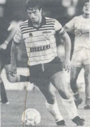
The Hamilton Steelers, left, and North York Rockets were two of the original Canadian Soccer League teams. The Rockets’ reverse of these kits with navy tops and shorts, a white collar and white chevron on the shirt were even better than these.
I would argue that the smartest kit in the Canadian Soccer League was the North York Rockets. Their logo wasn’t great, but they took the chevron shape of the bottom of the rocket in the logo and applied it to the bottom of their kits. That may have had more to do with Umbro than the Rockets’ logo, but it still stood out.
It’s not earth-shaking, but it’s subtle, a little different and the kind of element that could withstand the test of time. It’s this kind of idea and approach that I think can work well for a new club.
The biggest problem with the CSL’s kits were that they constantly changing and by the end of the league most of the teams had fallen into a garish 1992 trend. The ability to use a type of jacquard fabric for a kit was too much for most designers to resist once it became available and while some teams (notably the Dutch in 1988) used the technological advance for the good of mankind, most did not.

Hamilton Steelers 1990 kit.
Seriously how did Hamilton go from this in 1987 to that in four years?
The Vancouver 86ers were the most consistent in look and on the pitch and deserve some credit for going away from what the Whitecaps had done previously. The Winnipeg Fury’s kit isn’t anything special, but at least the crimson and the double hoop is a little novel. They had ditched both by the end though.

Toronto Blizzard’s 1987 kits were my favourite out of the six seasons, but they only lasted a year. Sadly I can’t even find a good photo of them. They played in a white top with red sleeves and then double red stripes on the shoulders (much like these stripes on Mississippi football jerseys). It’s remarkable that it’s so difficult to find a good image of so many CSL kits.
The Hamilton Steelers’ gold with a white band in the middle and black shorts weren’t bad, but the white on gold could have used a little more black trim. These 1988 kits (gold with black trim) are an upgrade.
Collin Miller captained the 1988 Hamilton Steelers in these gold and black kits.
So what does that mean for the CPL? Well, I think a broad use of colour is a good start.
Finding an element, small as it may be, or a colour combination that is unique to each kit and can endure different style changes would be a great step.
Having at least one team play in a unique colour would be good. And ideally it would be a little more aesthetically pleasing than the Seattle Sounders’ rave green.
York9 FC could represent their region and the Baldassarra family’s Italian roots with nine vertical stripes. While that could look a little busy (though SPAL’s stripes look pretty good and are timeless (Yes, that’s a 20-year-old Fabio Capello). Perhaps, instead of distributing equally, the nine stripes could be grouped into threes, to give the larger impression of three larger stripes and a more traditional look.
An interesting shade of wine, crimson or carmine for Winnipeg? A slightly different blue for Halifax?
I hope the league’s designers try something a little creative (emphasis on little, less is almost always more in kit design) and once they find something that works, have the faith in their convictions to let it grow into an enduring look.
— thanks to Dave Morrison at NASLjersys.com for doing an incredible amount of work to archive kits, logos and rosters from North American soccer leagues of yore. His site was indispensable in writing this piece.

