Matthew Gourlie
The Canadian Premier League is going to experience some growing pains in its early years.
As long as they get more right than wrong, learn from their mistakes and keep improving there is every reason to believe that they can thrive.
Thursday, the CPL unveiled their first selection of kits and while they weren’t all winners, they were vibrant, full of unique colours and offered a bold vision that stands in contrast to the other major soccer league in North America currently and is light years ahead of most of the offerings from Major League Soccer’s debut season.
Like the league itself, many of the designs have all of the elements in place to evolve into something great and special. Others are ready for prime time already.
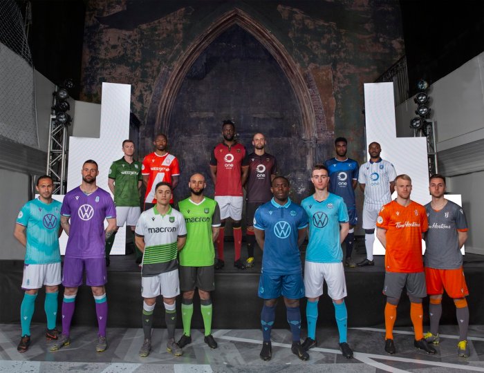
The first kits for Canadian Premier League sides Cavalry FC, back left, Valour FC, FC Edmonton, Pacific FC, front left, York 9 FC, Hfx Wanderers FC and Forge FC were unveiled Thursday.
Since we clearly have thoughts about kits and design, here is our first blush ranking of the kits after their unveiling:
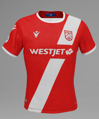
1. Cavalry FC home: it may have been obvious to take the white sash from the Lord Strathcona’s Horse (Royal Canadians) regiment that helped inspire the club’s name, but the sash gives Cavalry a identity that can endure the decades and doesn’t feel forced. It’s a design element that is club specific and that is sadly
The simple red-and-white combination is classic Calgary and perfectly paired with the WestJet sponsorship. The horseshoe on the back is a nice touch, but a little too large and pervasive.
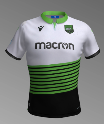
2. York 9 FC home: the raggazi down at Macron HQ had a near-impossible task: take York 9’s unusual green, work in nine stripes and make it look good. They pulled this home kit off better than they had any right to. The stripes don’t look forced, the green collar really looks sharp, the way the grey breaks up the white on the kit and the white on the shorts is highly effective. The badge — not one of the better efforts to date — even looks good on this kit and pops. The grey socks detract from the overall look unfortunately, but this one is high partly due to the degree of difficulty.
3. Hfx Wanderers FC away: Halifax is one of two clubs whose have a decent kit out of the gate, but it feels like there’s a great kit in there somewhere that may come in the future. Still, this is a very good start. The sky blue looks great in the kit and the socks, the white shorts work, the wave pattern detail from the badge is used well in the kit. A navy blue collar would have made this even better.
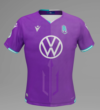
4. Pacific FC home: a daring choice of colour and they absolutely own it. The trident pattern on the front is tremendous and could be even more pronounced as could the two-tone print of the top. When you have an element as cool as a trident to play with, use it. They also boast the best socks in the league. That being said the purple on purple on purple is maybe a little too much. Like Halifax, there is a great kit out there with these colours. This isn’t quite greatness yet.
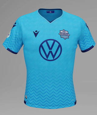
5. Hfx Wanderers FC home: a little too monochromatic with the blue, but it’s a great shade of blue. The light blue collar helps a lot, but it’s still a little too one note. Using a badge that was light blue and not the full badge with the white at the top was a mistake because it could have used more contrast.
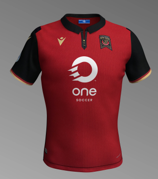
6. Valour FC home: it’s kind of hard to mess up that deep crimson and gold colour combination too badly. There’s a reason Ironman always looks cool. I like that they tried something different with the black sleeves. I’m not sure how effective they were, but it’s a solid effort and a pretty strong look.
7. Pacific FC away: another unique colour that firmly establishes an identity for Pacific FC. The “ocean waves pattern” takes away from the whole thing for me though. The badge also gets almost totally lost at any distance. On the whole this wasn’t quite as great as it could be. I am sure that I will be excited to see what Pacific FC comes up with as a kit year-to-year and I think they can top this pretty easily.
8. FC Edmonton away: We’re starting to get into a group where we’re splitting hairs a little. A safe and clean look. The not-straight pinstripes are an interesting element, the collar helps a lot and the badge looks good on the white kit, but generally these are fairly bland. They’re still better than most of the all-white kits in MLS, but that’s not saying a lot. The nod to the Saskatchewan River in the literature is odd because the river actually snakes through the city and travels from the northeast to the southwest. There is no top right to bottom left elements really and nothing that evokes the river.
9. Cavalry FC away: I really like the green as a secondary colour. It’s an odd combination for a club that normally wears red, but I think that helps make it work. The shade of green looks quite good and the collar is interesting. The only downside is that the camo print doesn’t really work for me. It could have been much worse, as camo goes, but the whole idea might be a little too on the nose.
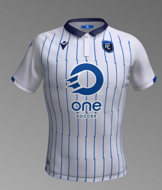
10. Valour FC away: These aren’t bad, but they didn’t quite pull them off for me. The red dot element is tremendous, but the overall effect from a distance is a little muddied. Up close they look really sharp and if we’re ranking these on if you would wear them out to a club or pub, these are near the top of the charts. In the handout infographic the kit looks black. In photos from Thursday it looked more like a dark purple. The Valour VW is a nice touch on the back of the kit. Much like the Valour badge, it looks very good up close, but at a distance it’s a little dark and unclear.
11. FC Edmonton home: The band of lighter blue reminds me just enough of their NASL kits to feel like there’s a little consistency through the eras and hints at the wavy line in the E on the badge. It’s a little monochromatic, but safe and solid. Not the greatest shade of dark blue and the badge gets a little lost. They also get points for retaining the rally rabbit. It would have looked better on the colour or just below the collar on the back, but at last it’s there.
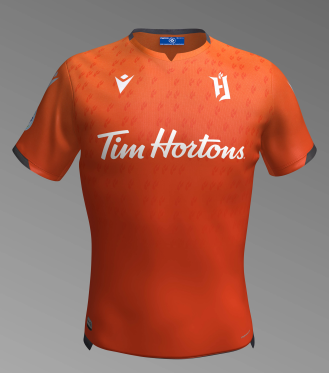
12. Forge FC home: There’s good news and bad news here. The good news is that the top is in a magnificent bright orange, they’re going to stand out and look great if their supporters wear the kit in large groups. The Tim Hortons sponsorship is great too. Six of the seven teams have fairly plain white shorts and the team that doesn’t is the one that needs them the most. I was afraid that Forge would go all-orange much like the Houston Dynamo. That would have been too much, but it would have been better than this. Black shorts would have been fine. White shorts elevate this look into the top-three. Instead the grey kind of undoes it. The orange of the socks doesn’t match the great orange on the kits. The good news it’s very simple to fix and the top looks sharp.
13. York 9 FC away: If the Macron designers knocked it out of the park with the home kit, the essential issues with York 9’s colour pallet did them in with the away kits. Like a chef on Chopped given a tough ingredient, they just buried the nine stripes in the fabric the second time around. I’m not sure what name York 9 actually gave to that muted phlegm colour, but when you combine that with grey, there isn’t much good that’s going to come out of it.
14. Forge FC away: Only in the buttoned-up, don’t-celebrate-too-much world of Major League Baseball do sports teams generally wear grey. For me there’s just really not good reason for it on a soccer kit. You can make anything work and there have been some exceptions over the years, but mixing it with a bright orange just doesn’t work at all in my opinion. My first thought was of the 1995-96 Manchester United kits. Widely reviled, United actually switched out of their kits at half during a match during an away defeat to Southampton. The fact that up close it looks like the same pattern as my 20-year-old sweatpants is not great either.


